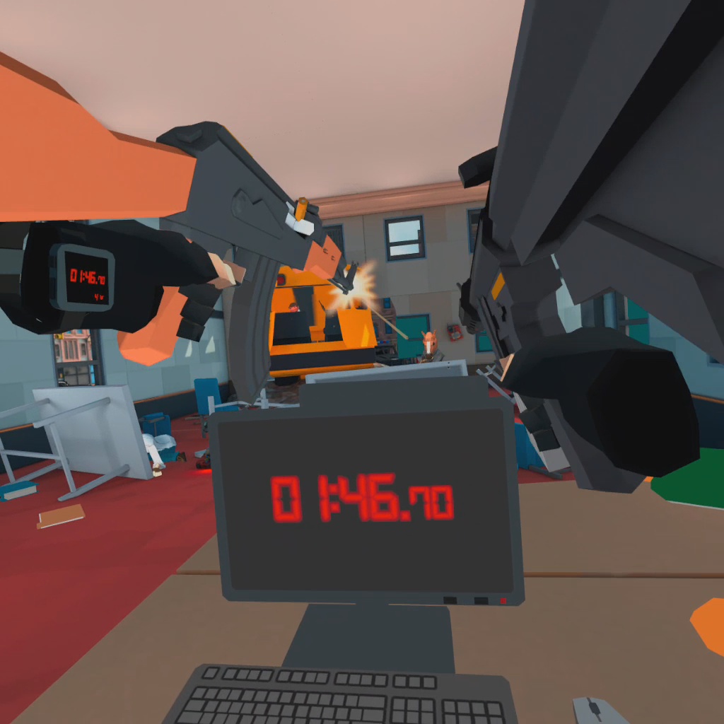
YouTube thumbnails are critical for any growing channel. You gotta get the click to get the views, and you need the views to get that sweet, sweet internet fame™.
Unlike on TikTok or Twitch, your thumbnails are going to be one of the main drivers of users to your content, whether it be from their subscriptions or related videos bar. If people love your video enough to share it, the thumbnail is what populates the preview places they'd share, like on Discord!

If YouTube is your bread and butter, you shouldn't neglect what is the "front page" of your video. There are a few simple goals you should work towards as a professional content creator when making (or commissioning) your thumbnails:
1. The technical stuff:
Thumbnails on YouTube are in a 16:9 aspect ratio, usually 1920x1080. You have 2 MB to work with in a JPEG, PNG, or GIF format, but no animation!
2. Make sure your thumbnail is highly readable!
High contrast helps here. Make sure your thumbnail text is a radically different color than the background, or use a drop shadow or stroke.

Mike from Virtual Reality Oasis uses white text with a black stroke, a great color combination that makes text readable on top of any color. To add some extra flair, he adds a blue drop shadow behind the text. The text itself is blocky and easily readable.
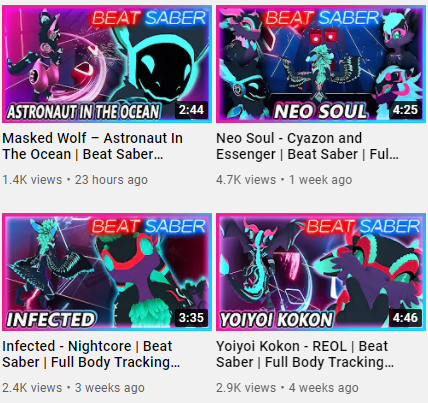
The placement of the text is key too. The total run time of a YouTube video is usually displayed in the bottom right corner. Be sure to avoid putting any critical elements there!

ANABURN uses the game logo here instead of typing her own text. The logo already has high contrast, using white text on a darker orange and brownish background. She also does a great job stylizing the thumbnail, making the entire thumbnail a more muted orange color. You know what game is featured in the video immediately!
3. Keep a consistent brand!
Whether it be your face, logo, or a particular color scheme and thumbnail style, consistent thumbnails make it easy for viewers to recognize your content.
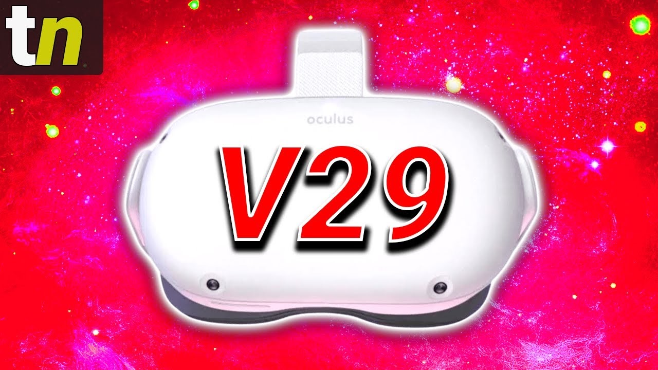
Thrill usually uses a bright red color in the background of his thumbnails. His Tuesday Newsday videos stand out thanks to the “tn” logo he places in the top left!
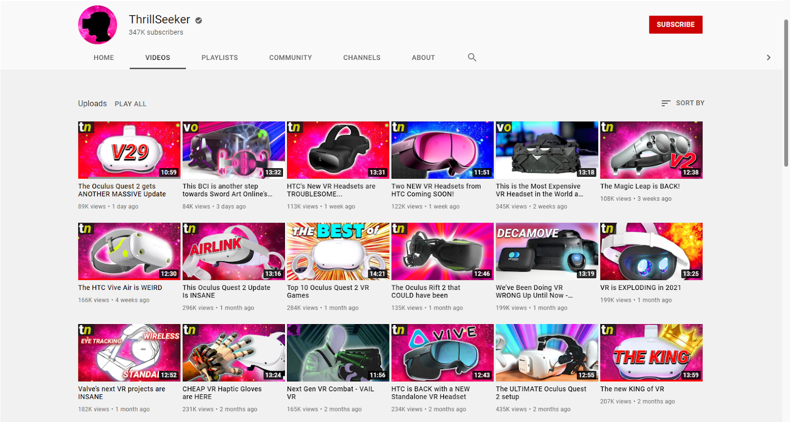
In the Western world, we usually read from top left to bottom right, making it easier for viewers to pick up quickly on which video they're about to see.
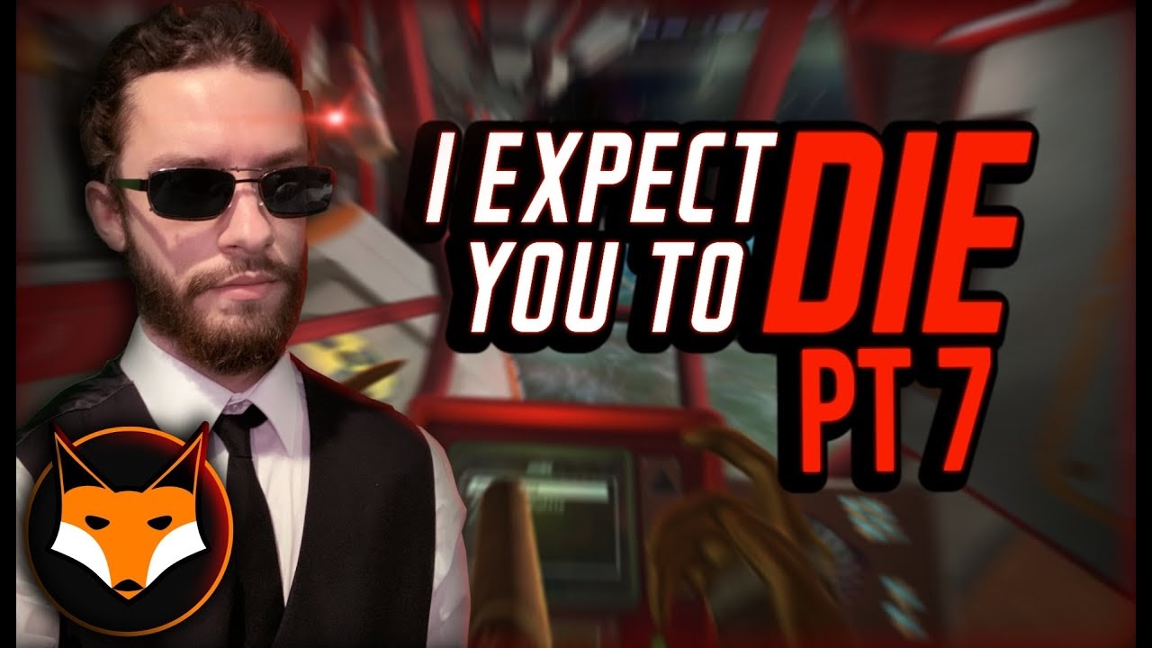
Soul Fox Gaming puts his iconic logo in the bottom left of his videos so the timecode doesn’t block it in the bottom right. His regulars recognize him, and we know exactly what game he’s playing even before you click.
4. Show a face!
It should come as no surprise that our eyes are drawn to faces, and eyes on your thumbnail will make it more likely you’ll get that click.

You can’t (practically) wear two headsets on your head, so Cas finds a good alternative here, while also making sure viewers recognize it’s one of her videos.

It doesn’t always have to be your face though! You can use your Beat Saber avatar, your POPULATION: ONE in-game character, or a celebrity.
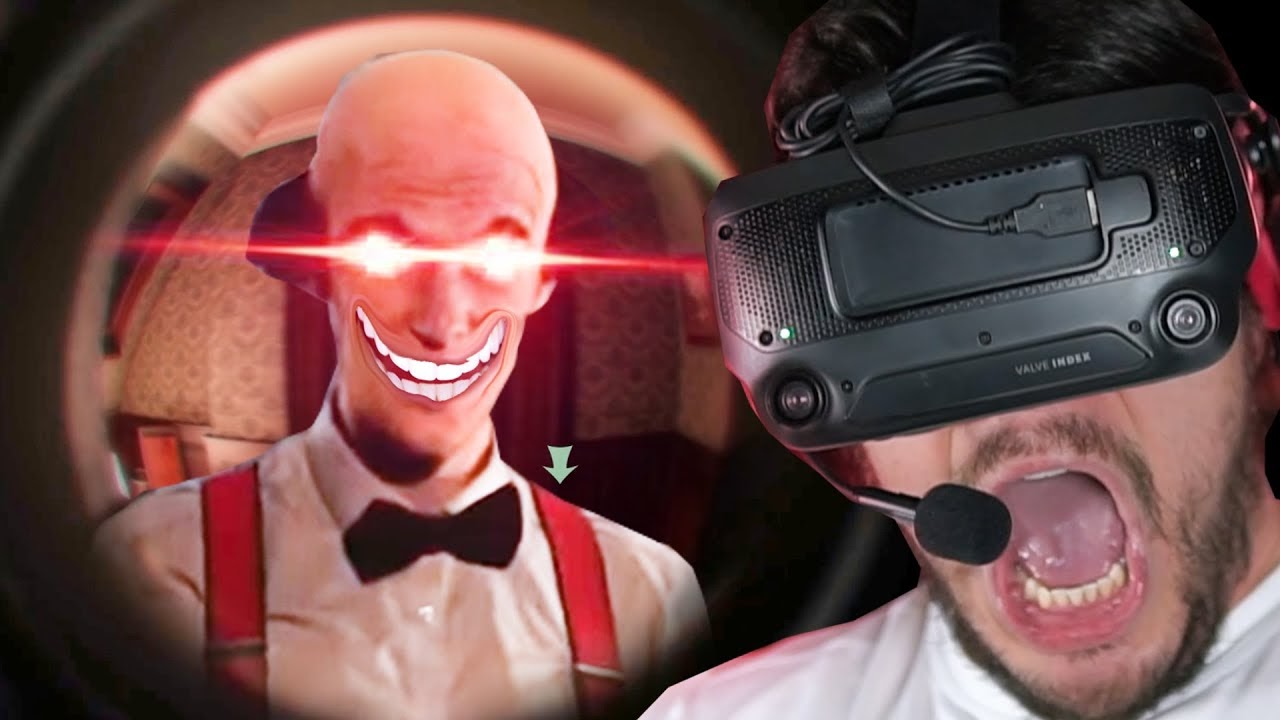
No matter whose face you choose, remember the other half of the rule “show your face” is the “show” part! Don’t block anyone’s forehead or chin with text. The one exception for VR creators is that they’ll usually be wearing the headset they’re showing off in the video. If you do cover your eyes with your headset, the lower half of your face should be able to convey how you’re feeling.
For EddieVR, it’s terrified. My guy is absolutely terrified.
Let’s tie it all together!
Outside of the VR space, Philip Defranco utilizes all of these tips together beautifully on his daily news show.
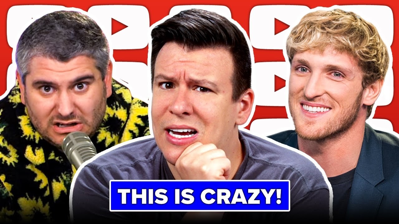
His text? Readable. His brand? That red YouTube backdrop. His face? Multiple faces.
Defranco’s thumbnails leverage a recognizable and easy to replicate design (which I’m sure his thumbnail artist loves) and features multiple faces that you may want to hear news about.
Hopefully this helps elevate your thumbnail game to get your mixed reality videos the views they deserve. Do you have any favorite VR YouTubers? Any thumbnail tips I may have missed? Let us know in the LIV Discord or on Twitter!


